How do you adapt an iconic book into another medium? Illustrator Chris Mould shares his approach to transforming H. G. Wells’ classic work into a glorious graphic novel.
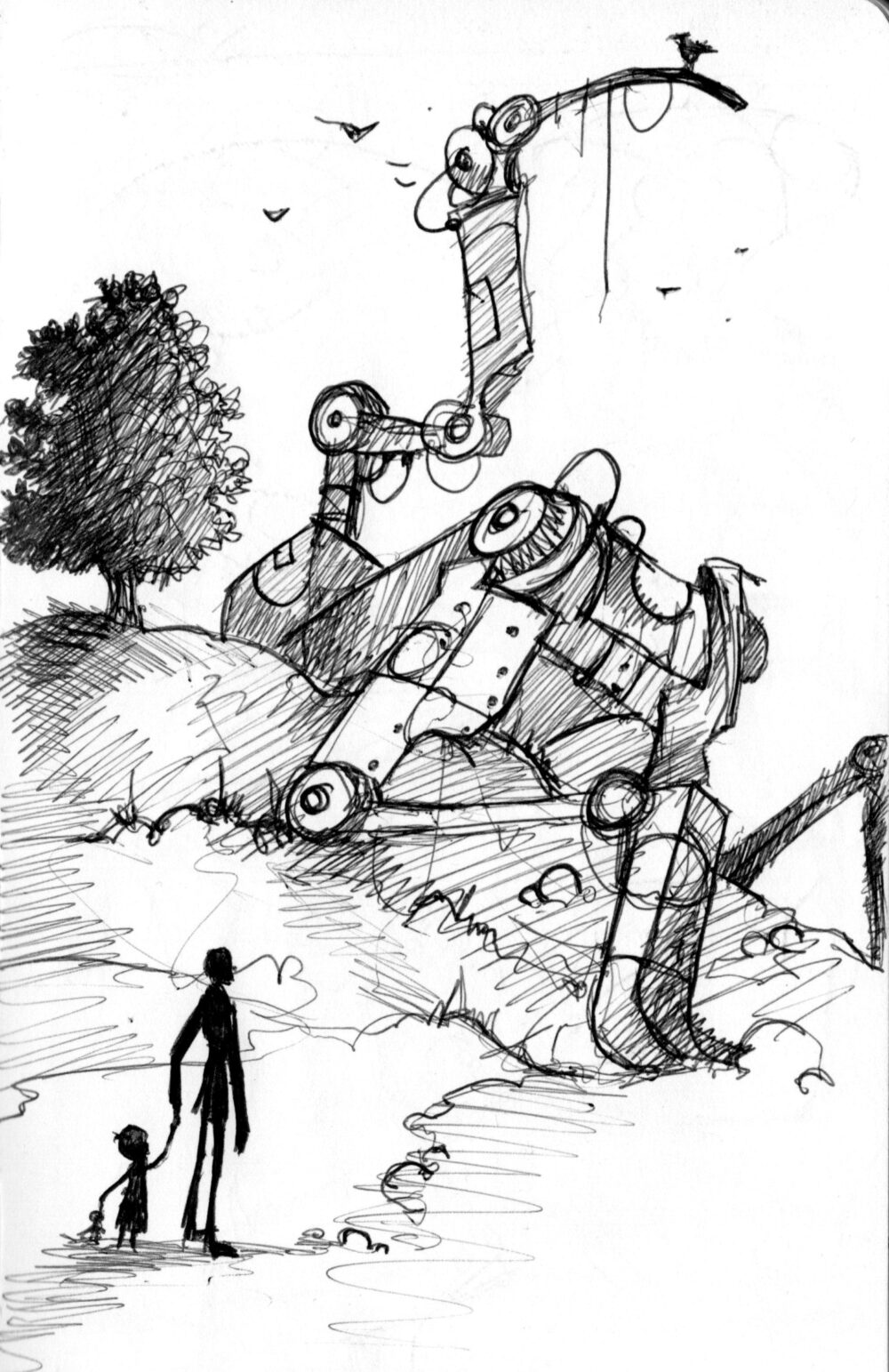
I’ve been really lucky to be in such good hands at Faber. Both editorially and on the design front.
My editor Leah Thaxton is a very creative and innovative publisher and Ness Wood is the freelance fairy godmother of children’s book design. I think having the right people around you makes a huge difference and is always the best starting point.
When I first talked about the text with Leah we both felt that it needed help to sit comfortably in the current market and adaptation was the obvious answer. I felt happy tackling this and it meant I was able to make some changes. My experiences of sci-fi had mostly been through film and I had seen some great, strong female leads in characters like Sarah Connor from The Terminator, Ellen Ripley and the young, orphaned Rebecca from Aliens and Rebecca and Pris from Bladerunner. So I used this moment to add some female spark. The idea that Victorian / Edwardian women were all just emotional wrecks in hooped dresses crying in a corner is such a tired and frustrating idea.
The format uses a panelled, sequential artwork layout in between limited text spreads that also have artwork decorating the spaces and I guess that’s what we can broadly refer to as a graphic novel. In other words, it’s a story told via the use of text and artwork but with a heavy emphasis on the visual to lead and carry the narrative.
The War of the Worlds is known as one of the earliest significant pieces of science fiction and is possibly the first publication about alien invasion. It has never been out of print and is a well-travelled road for illustrators, film makers, concept artists, animators and much more. I think that’s because we love the concept of the possibility of the unknown and it means we can use our imagination freely.
Whenever an illustrator visually re-thinks a classic text, I personally feel that what people really want to see is, what have they done with that main element, the alien character or the monster or the pirates? If someone has illustrated Frankenstein, I want to see what they did with Mary Shelley’s creature. What visual elements have they used to create their own idea of how he should look? And this was exactly the same. People want to see how you’ve re-created those awkward three-legged machines. How do they appear, how do they walk, etc. That’s where the love is for this narrative.
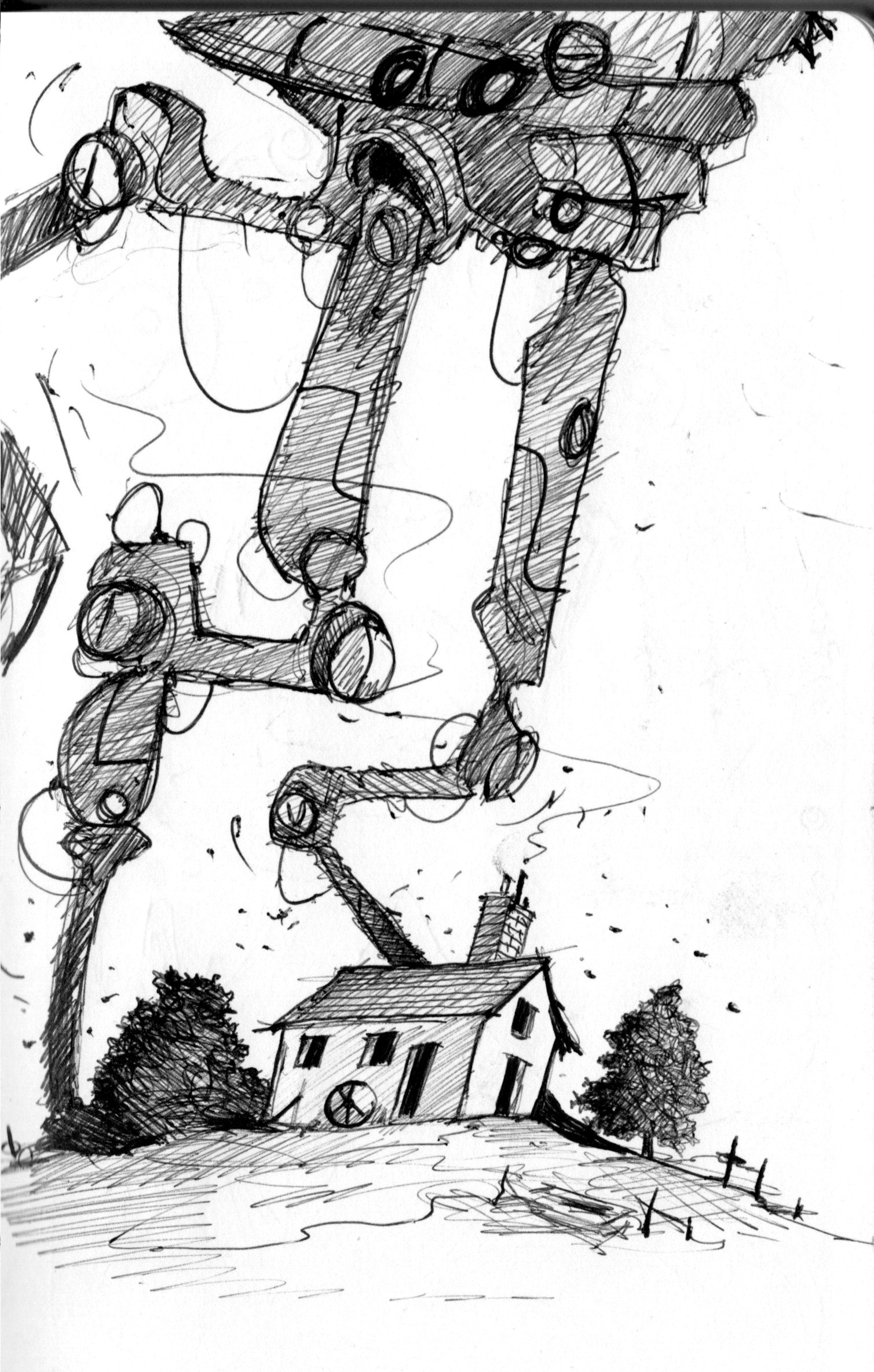
I have a folder on my computer and it’s all the versions I did before I was happy with the tripods.
There are about thirty different designs and that’s on top of all the ones in the actual sketchbook that appeared before I started to properly consider their look. I always look at lots of references and mix up everything I find.
There isn’t really anything that moves naturally in a three-legged way, so it’s hard to use comparisons. I had to come up with something that felt and looked convincing and justify to myself why these things would have three legs and not two or four. So the design is a top-heavy, elongated head, that in theory would need added support beneath it at the back to stop it from losing its balance.
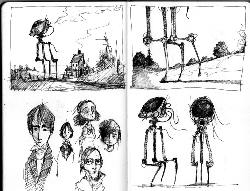
I always use lots of references before I start.
Concept art, photos from nature, mechanical or structural references, etc. So the machines are a mixture of robotic and engineered working parts as well as being insectoid and / or animal like. For example, I’d draw bits of cogs and wheels and workings whilst throwing in creepy long-legged joints and antennas from flying bugs etc.
Hopefully the final thing feels organic as well as mechanical because our visitors are alien and walking machine all in one.
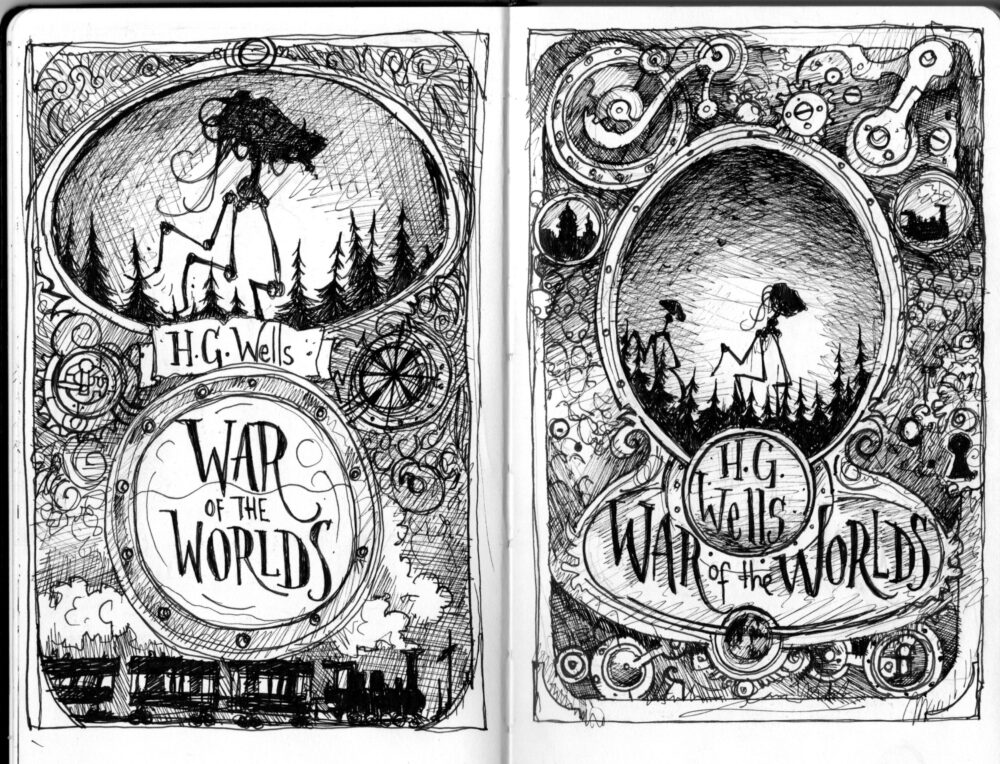
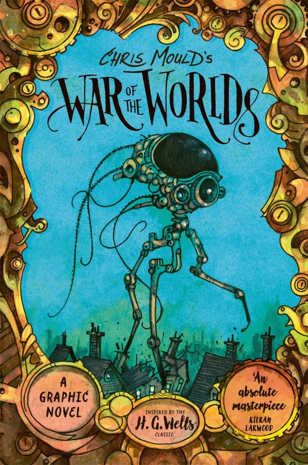
When it comes to covers, we always get our heads together and the focus on the imagery is a little more intense.
I was sitting with Leah at Faber HQ going through the insides and we both liked an image that would suit the cover, but it was a wide / double page spread image of aliens marching down the Thames amid the crowds and needed some focus and centralising.
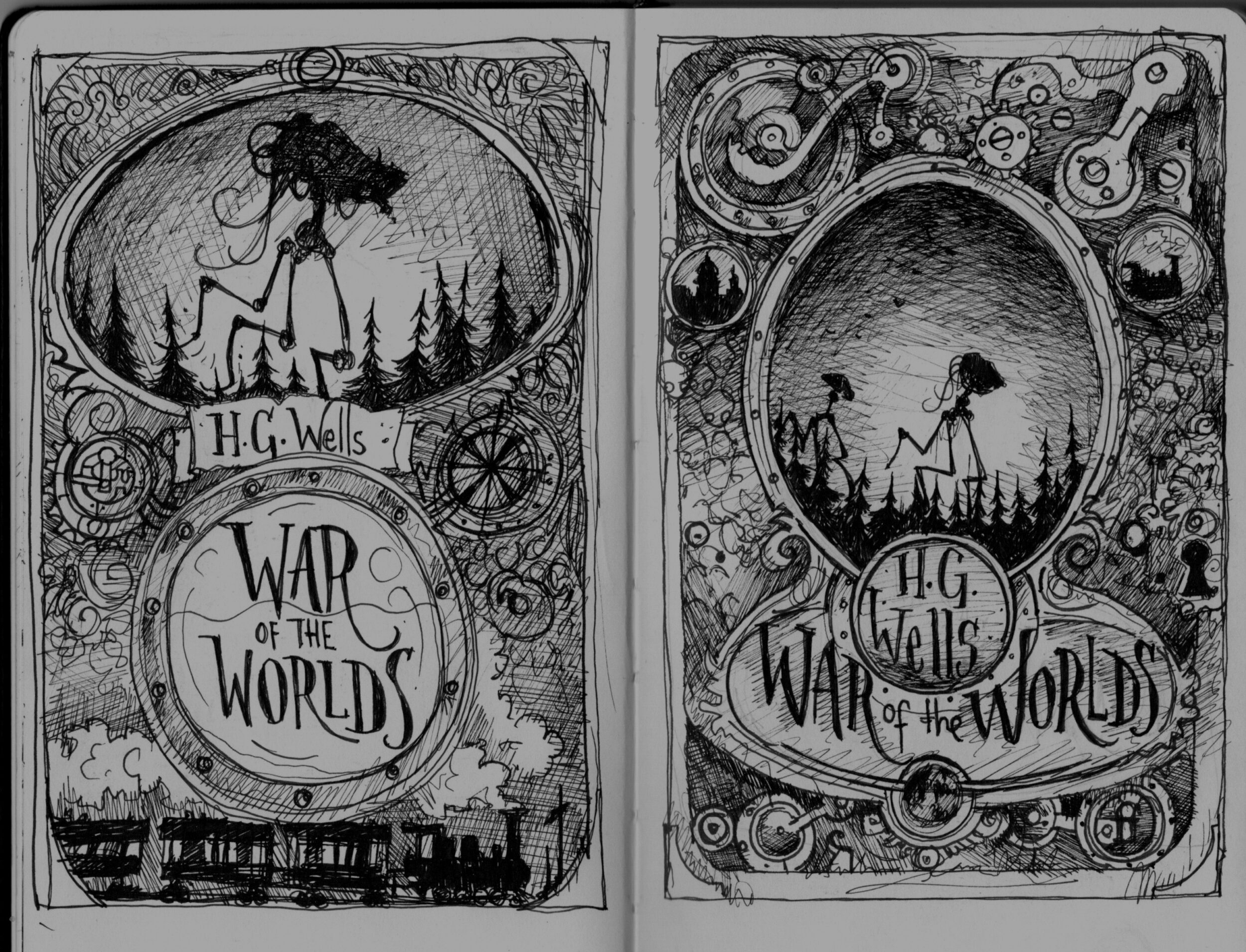
At the same time, I’d been playing in the sketchbook with some decorative mechanical panels. They had levers and cogs and were suitable for a border or frame so we mixed the two ideas together to create the look.
I’d played around with some hand-drawn text which is another element I also like to incorporate and it was beginning to feel close to what we wanted. Ness is always great at pulling an idea into shape and we eventually ended up with something I think we’re all really happy with.
I’m extremely grateful to Leah Thaxton and Faber for giving me this opportunity and it’s very rare for me that I’m actually happy with a finished book! But this time around, I am!
Chris Mould’s War of the Worlds: A Graphic Novel is out on 10 October 2024.
A graphic novel retelling of the classic – Chris Mould takes us to the brink with a diary that records the alien invasion of England.

